

A website can look finished and still confuse its visitors.
Many websites have polished colors, complete pages, and working buttons. Visitors can still leave unsure what the business offers, who it helps, why they should trust it, or what to do next.
Clearer structure helps people understand a page and can make its facts easier for search engines and AI systems to interpret. It cannot promise rankings, citations, recommendations, traffic, leads, revenue, or sales.
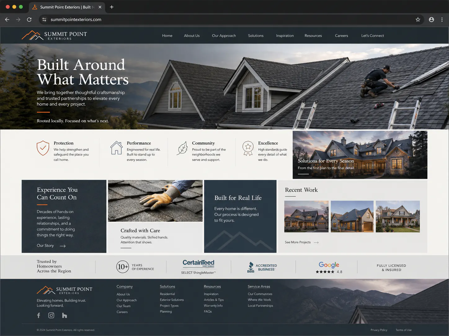
Six places confusion usually starts.
The visual symptoms vary. The underlying problems are often more ordinary.
- 01The offer is vague.
- 02The audience is unclear.
- 03Proof is missing or buried.
- 04Too many actions compete.
- 05Essential information is difficult to find.
- 06The page is difficult for search and AI systems to interpret.
-
The offer is vague.
A visitor sees broad promises, industry language, or a list of capabilities but still cannot say what the business actually sells.
Try this: Name the service or product in ordinary language, then explain the practical problem it addresses before adding detail.
-
The audience is unclear.
When a page tries to speak to everyone, the right customer has to work out whether the offer fits their situation.
Try this: State who the offer is designed for and describe the moment that usually brings that person to the page.
-
Proof is missing or buried.
Claims arrive long before examples, experience, process details, or other evidence that helps a visitor decide whether to trust them.
Try this: Place the most relevant real proof near the claim it supports, and label examples honestly when they are demonstrations rather than client work.
-
Too many actions compete.
Several buttons ask for equal attention, so visitors must decide how the website works before they can decide what they want.
Try this: Choose one primary next step for each page and make secondary paths quieter, more specific, and clearly different.
-
Essential information is difficult to find.
Price context, timing, location, service area, requirements, or contact details may exist but appear too late or under an unexpected label.
Try this: List the questions a serious visitor asks before acting, then give each answer a predictable place and a plain heading.
-
The page is difficult for search and AI systems to interpret.
Vague headings, scattered facts, and unsupported claims can make the page harder for machines to parse for the same reason people struggle with it.
Try this: Use descriptive headings, consistent facts, useful source material, and structured answers—without treating clarity as a promise of rankings or citations.
A clearer page follows one reading path.
Visual polish can support this order. It cannot replace it.
- 01Offer
- 02Audience
- 03Proof
- 04Next step
Check your own website before changing it.
You do not need a redesign plan to answer these seven questions.
- Can a first-time visitor explain what you offer after reading the opening section?
- Does the page make clear who the offer is for and when it is useful?
- Is real proof placed near the claims it supports and labeled honestly?
- Is one primary action more obvious than every secondary action?
- Can visitors quickly find the practical information they need before acting?
- Do the headings tell a sensible story even when the body copy is skimmed?
- Does each page have one clear purpose and a logical path to the next step?